It’s logo making. The company or brand logo is important. It represents the company’s product or service. It is the face of the organization for recognition and sometimes also use to advertise.
Classy? or Minimalist?
The problem in creating a logo is making it unique and interesting without losing the element resembling the objective of the company.
If you look in the first version of the logo I made, the element of teacup in perspective view is there. There’s also a Tapioca, in our local place we called it as “sago” – it is the soft rounded, sweet jelly-like, that we used as bullet during our childhood war, submerged in a sweetened drink (dissolve washed sugar), the representation of HOT. We called this type of logo as a Combination mark. So it wasn’t simple, I used three colors and too many elements. Combination of two font to emphasize the word “Tea”. I want it more classy. What is the best ingredient to make a minimalist type of logo? Like a one silhouette logo but all the things I want to show can be expressed. I think I need to check other logos on the internet. Idea.. idea.. idea.
My second idea of the business logo. I’ve created many logos for my friends but making your own logo is not easy. For this one, I remained on using the two logo (Satturday Collection for “Chris” & “nity” and Cold Climate for “Tea”) this time I tried to incorporate the silhouette of Bible by using a ribbon bookmark and half face of a tea cup, I guess there’s no other good representation of a tea but a tea cup, anyway it could also a coffee who knows we will include coffee on our menu. Right now I’m crafting my third logo and hopefully one of this will be approve by my partners.
Your suggestion for my third logo is highly appreciated. Just right on the comment box below. Thank you in advance!
I resume editing this post to update the development on our logo.
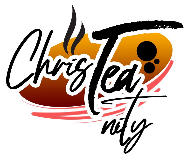
This third version of logo shows a coffee bean to resemble that the company is also offering hot and cold coffee drinks aside from the sub line located in the lower part. The main symbol in this logo is the tea bag with all elements and the name of the business inside. I’m still using the same font I used from the beginning. Well, this will become one of the options.
This fourth version of the logo is more elegant and simple. The tea bag and string served as the ribbon that is usually found on Bible as bookmark. Two coffee bean to represent other drinks the we will offer. I hope you got the meaning of the logo.
